
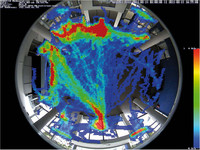
Visualize Highly Frequented Areas (Heat Maps)
Which shelves in the shop are attracting the most customers this Saturday? Which paintings by the new artist hold the attention of the visitors most? Which waiting areas in the departure hall are preferred in the afternoon?
Click into the image to enlarge.
All movements of objects of a particular size are recorded and evaluated, either in the live image or in a previously defined detection area, to provide answers to questions like these. The frequency of the movements is shown visually by means of different colors in a heat map. The areas with the most movement are shown in red, and those with little movement in blue.